A2 PHOTOGRAPHY - EMILY MOORBY
MUSIC CULTURE
Barbara Kruger

Like Adam, Barbara is American, however she is more of a Conceptual and Collage artist; rather than primarily Photography based. She was born in 1945, and is best known for ‘Visual Art’. Barbara lives and works in New York and Los Angeles, and her work consists of Black and White images, accompanied by an overlay of text. The text used in Barbara’s work often includes personal pronouns such as ‘I’, ‘we’, ‘they, ‘your’ and ‘you’. As well as using the personal pronouns, Barbara bases her work around Sexuality, Power and Identity, and this is why some of her work is seen as controversial by some people.
‘Pictures and words seem to become the rallying points for certain assumptions. There are assumptions of truth and falsity and I guess the narratives of falsity are called fictions. I replicate certain words and watch them stray from or coincide with the notions of fact and fiction’.
Barbara first took up in Photography in 1977, and her work is heavily influenced by her experiences as a Graphic Designer. I find Barbara’s work heavily influenced by the ‘Pop Art’ movement, and I really like the way she tries to make statements with her pieces; whether is be with regards to Politics, or Feminism.
I have decided to look at this creation from Barbara that features former president ‘George Bush’, as I believe that he is the reason America isn’t as great as it used to be. ‘Pro-life for the unborn, pro-death for the born’ is the featured quote on this piece, and the contradictory of it I feel symbolizes the ‘promises’ these leaders make to their country, but they have no intention of acting upon them. I like the contrast between the Red highlight of the text, against the Black and White image, and I find that the use of the Red makes the White text stand out more to the audience; and give impact as a result. When thinking about deeper meaning, Red is often referred to as a connotation of ‘Danger’ or ‘Anger’, the idea of Danger with relation to George Bush could be the fear of not knowing at the time what he was going to do that would impact the country, and many people were angered by Bush and his policies. Using a slightly pixelated image suggests to me that it was possible taken from a newspaper, which also symbolizes how these world leaders are constantly in the public eye, and even the smallest of things can be found out and exposes through the media. Back to the chosen quote, Abortion was illegal at the time in many states in the US, and ‘Pro Lifers’ would often protest in order to get their opinions across, allegedly ‘defending’ unborn children. However, with tragic events such as 9/11, says to me that there is no consideration for people who are already born and alive.

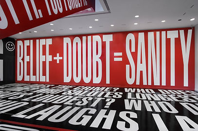
Compared to the George Bush piece, this creation is of a much larger scale, however the colour palette is still identical (Black, White and Red). This piece is presented in one of the lobbies in Hirshhorn Museum in Washington DC, and was designed and put up by Barbara and her team. With Barbara’s work, there is a persistent colour scheme of Black, White and Red, and I feel that this makes her work stand out and be more memorable to the people who see it, and also makes Barbara’s pieces all very uniform. I like how this piece shows the versatility of Barbara’s work, and it presents that she is not mostly reliant on photographing images to present to the public as pieces of her work. Especially with this piece, I like the boldness of the font used as I feel it stands out more to the
audience and provides more impact as a result. I also like the use of interrogative sentences that involve the people looking at the piece more, and this could actually make them think more about their own opinions and the world around them.